Synchronous Health

Synchronous Health set out to reinvent behavioral healthcare—combining human connection with technology to make mental health support more proactive, accessible, and effective. At a pivotal stage in their growth, they partnered with Circa to build a brand that could embody both their innovation and their compassion.
Brand GuideBrand MessagingBrand PositioningContent StrategyDesignDesign ProductionGraphic DesignLogo DesignMarketing StrategySearch Engine OptimizationUI/UXUser FlowWeb DesignWebsite Development
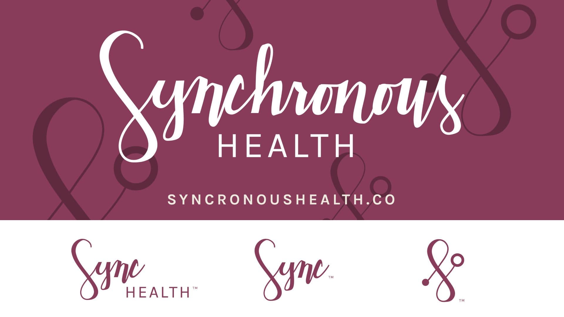
A brand logo sheet shows the "Synchronous Health" name in a white script font on a burgundy banner. Below, several logo variations are displayed on a white background, including a simplified "Sync" wordmark and a standalone stethoscope icon.

The Objective

Circa was the perfect partner to help Synchronous Health launch with clarity, credibility, and connection. We delivered a custom logo system, hand-drawn iconography, brand guide, marketable copy, and a user-friendly website to introduce their solution to the world. The result was a brand identity that balanced warmth with intelligence—positioning Synchronous for the growth we’re proud to see today. Years later, the brand we helped create continues to stand the test of time, evolving seamlessly as the company scales and expands its impact.
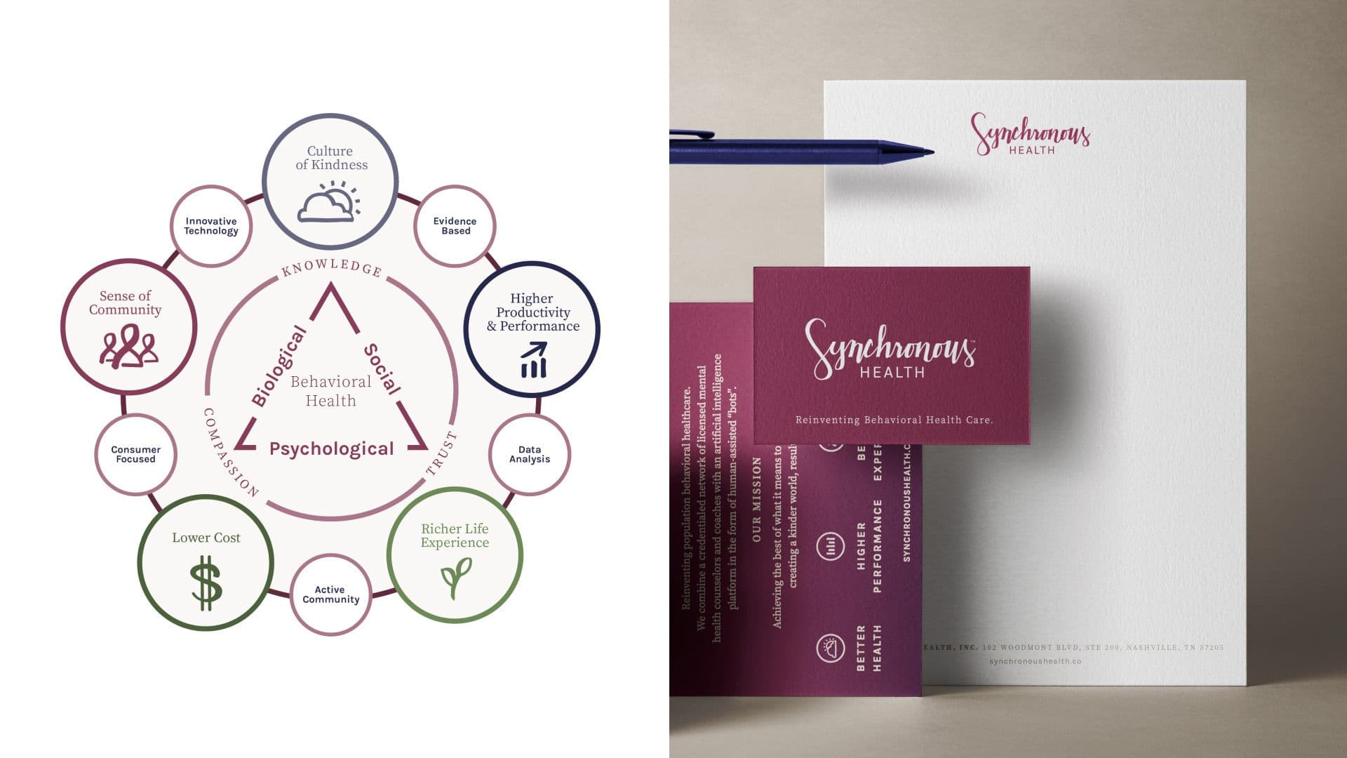
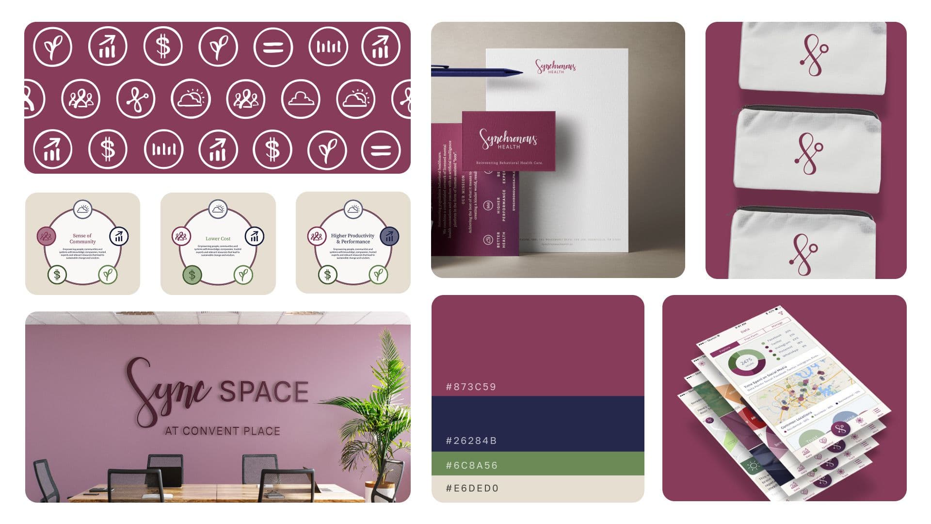
A split-screen image displays two aspects of the Synchronous Health brand. The left side features a circular diagram illustrating the company's behavioral health model, with keywords like "Culture of Kindness," "Lower Cost," and "Evidence Based" surrounding a central triangle. The right side shows a branded stationery mock-up, including a white letterhead with a pen and deep burgundy-colored business cards with the company's logo.

Built for launch. Built to last. A brand identity ready to grow with the company.
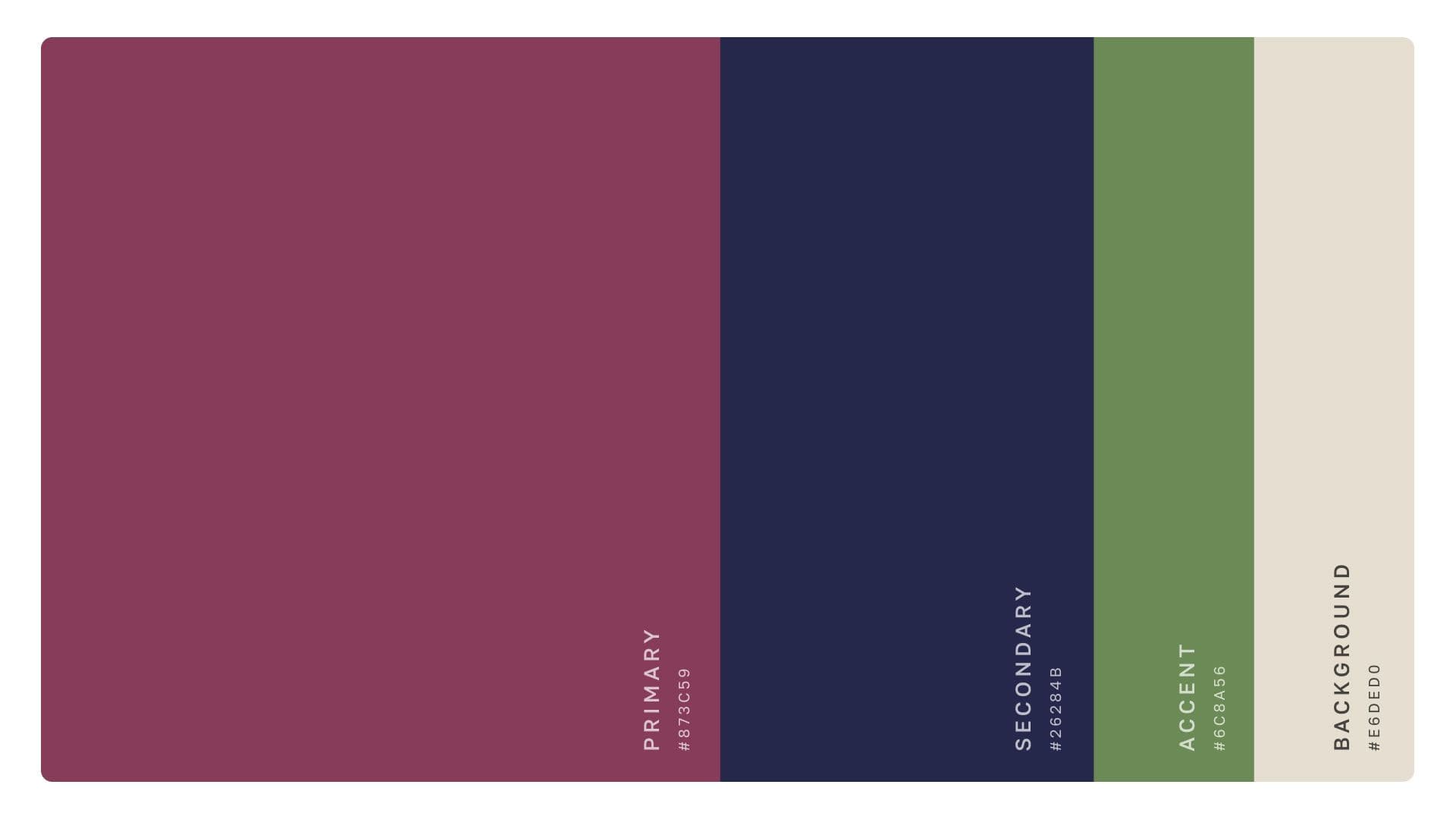
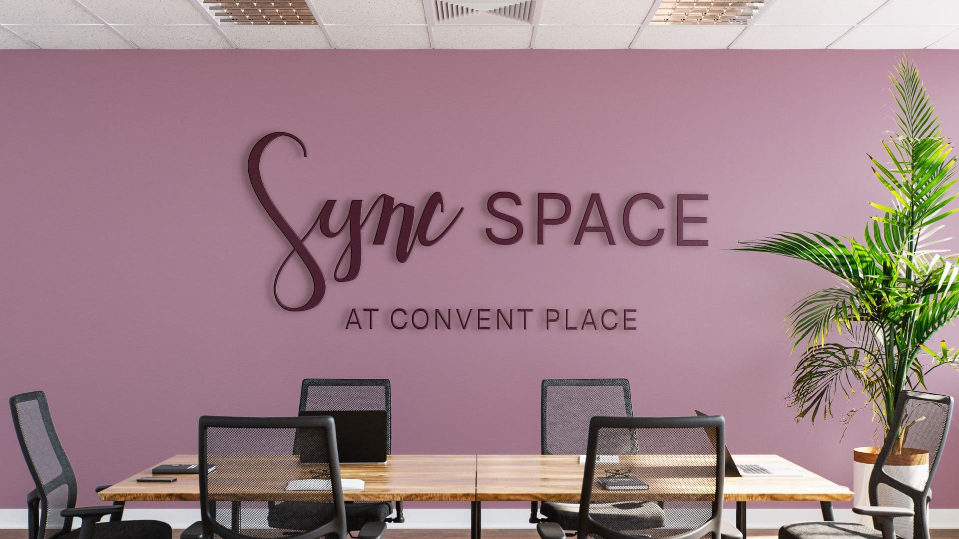
A color palette for the Synchronous Health brand, consisting of four vertical swatches. From left to right, the colors are: Primary (#873C59), a deep reddish-purple; Secondary (#262B4B), a dark navy blue; Accent (#6C8A56), a muted green; and Background (#E6DED0), an off-white.An interior shot of a meeting room shows a mauve-colored wall with the name Sync SPACE in three-dimensional, dark purple letters. Below this, the words AT CONVENT PLACE are visible in smaller lettering. A long wooden table with several black mesh chairs sits in the foreground, with a large potted plant to the right.

Human and high-tech. Design and messaging that connect on every level.
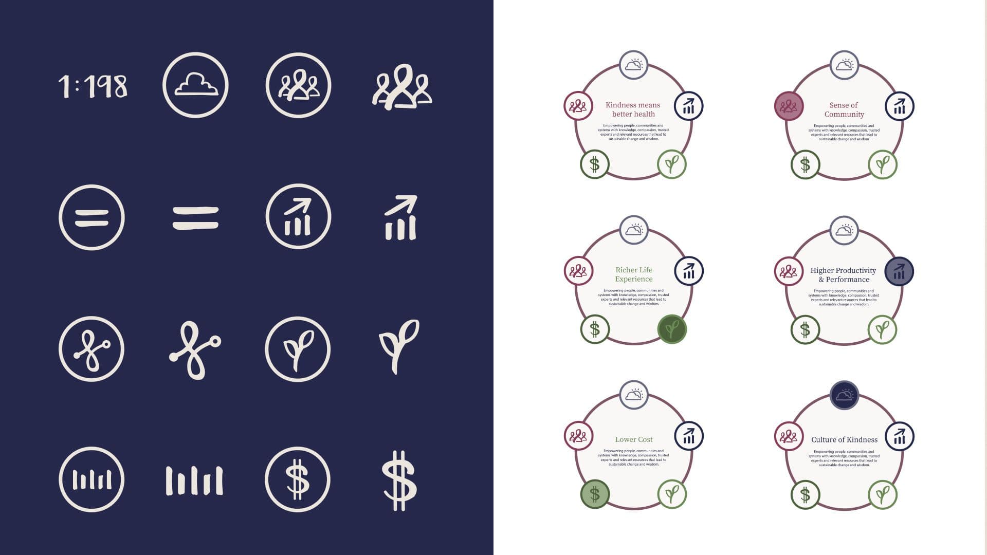
A two-panel image shows the brand iconography for Synchronous Health. The left panel displays a set of hand-drawn icons in white on a dark blue background, while the right panel shows six circular diagrams that combine these icons to represent different brand values on a white background.

Startup to standout. A visual system that remains relevant years after launch.
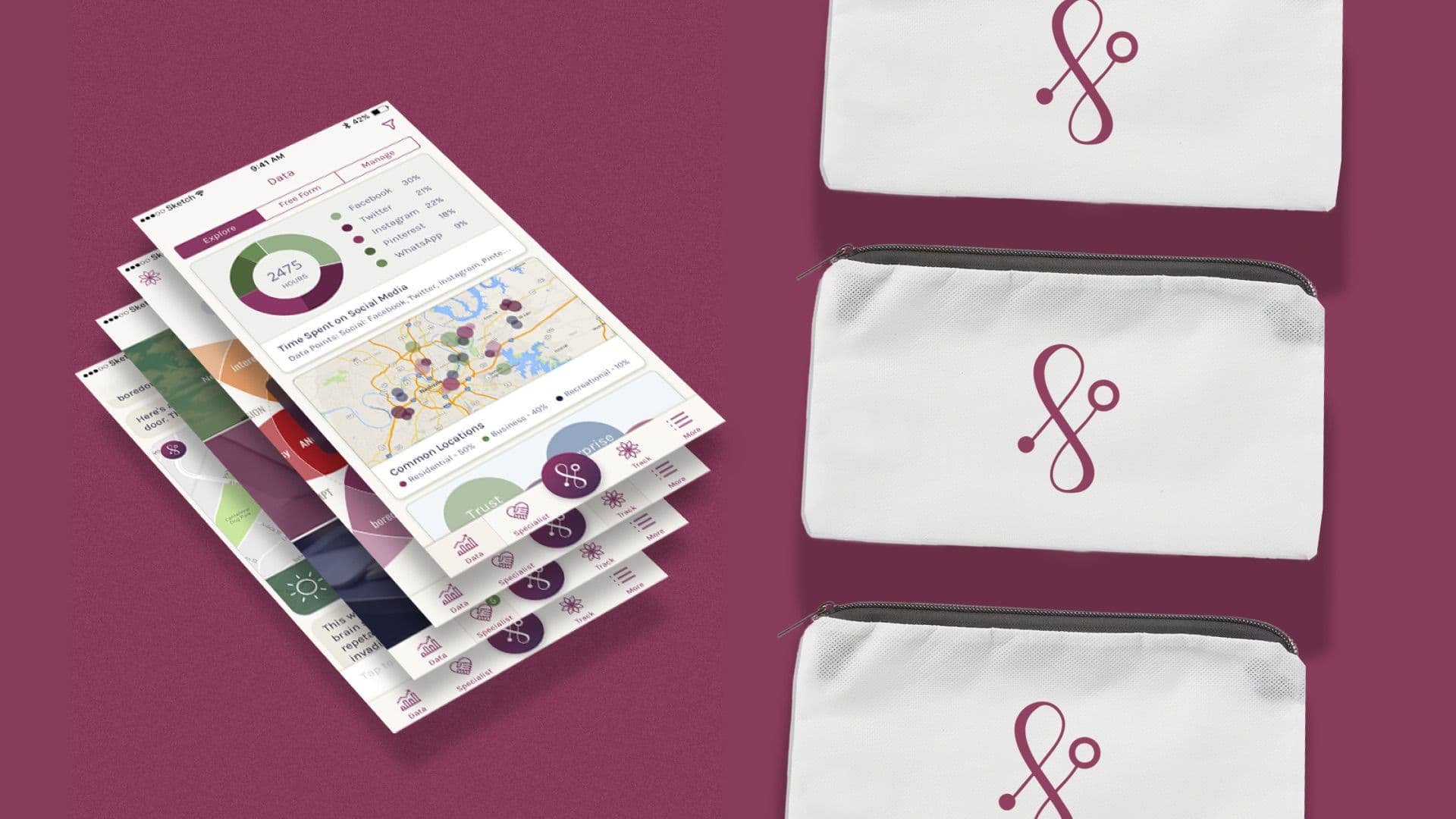
A composite image displays the branding for Synchronous Health. On the left, a fanned stack of mock-up mobile phone screens shows a data dashboard and app interface. On the right, three identical white zippered pouches, each featuring the company's burgundy stethoscope logo, are stacked vertically.A collage shows the complete brand identity for Synchronous Health. The visuals include the company's logo, icons, and color palette, displayed across stationery, branded pouches, a physical office space, and a mobile app interface.

Like what you see?

Start a Project