INTOO
INTOO is a global career coaching and outplacement company that helps people navigate moments of professional transition with clarity and confidence. With over two decades of experience and a human-first approach, INTOO supports both individuals and enterprise clients through coaching, digital tools, and personalized career development. As the brand continued to scale internationally, the company needed a digital presence that aligned with its evolving identity—one that could capture both its empathy and expertise in equal measure.

The Objective
Circa partnered with INTOO to lead a complete website and messaging overhaul—one that could unify audiences, sharpen storytelling, and evolve the brand’s online identity. From UX strategy and SEO-backed content planning to a refreshed visual and verbal brand language, every element was designed to reflect INTOO'S unique blend of scale and empathy. The result is a confident, approachable platform that brings order to uncertainty and positions INTOO as the go-to partner in career transformation.
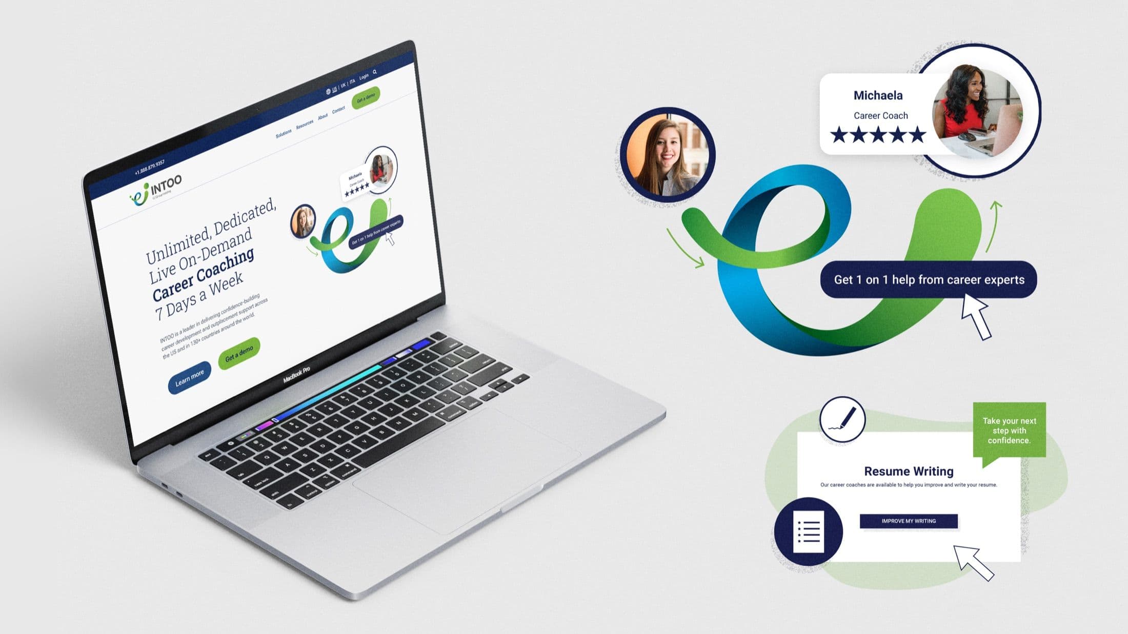
Circa partnered with INTOO to overhaul its website and messaging, bringing clarity, cohesion, and confidence to a brand rooted in empathy and expertise.

We helped INTOO evolve its online identity with SEO-backed content, intuitive UX, and a visual-verbal system that reflects its role as a trusted guide in career transitions.
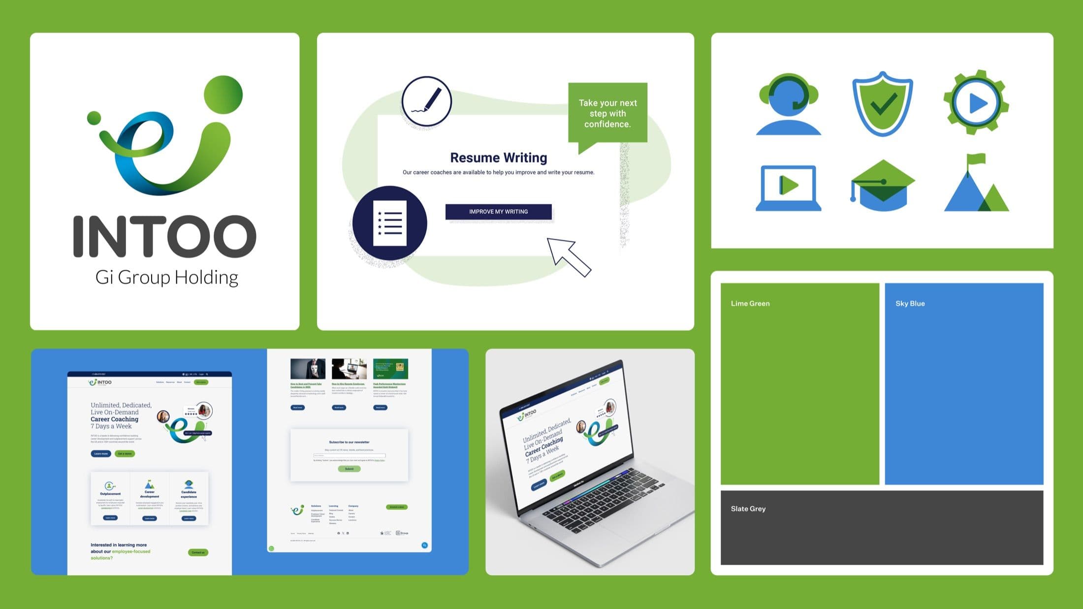
The brand system is rooted in clarity and care. From UX to messaging, each element reflects INTOO’s blend of empathy and expertise, bringing structure to uncertainty and positioning the brand as a trusted partner in career transformation.