RealSite Commercial
RealSite is rewriting what boutique commercial real estate looks like in Nashville—pairing sharp market insight with a brand of service that feels tailored, not templated. They work across office, industrial, and retail spaces with a precision that leaves nothing to chance and a style that’s distinctly their own. When it came time to bring that presence to life, they turned to Circa to craft a brand identity as confident, refined, and enduring as the properties they represent.

The Objective
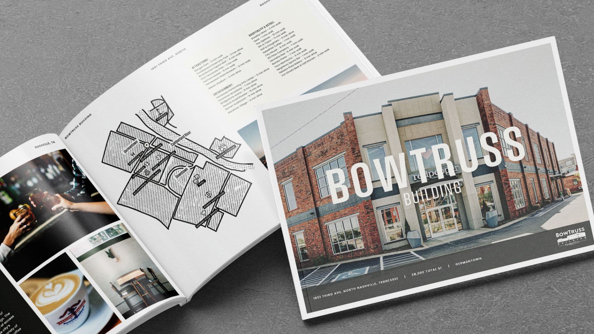
Circa set out to give RealSite a visual language that could close the gap between market expertise and market attention. The result: a custom logo suite, a palette that balances grounded sophistication with standout moments, and a typography system built for clarity and impact. We extended the identity into high-touch collateral—business cards, signage, and the BowTruss Building brochure—proving the brand works just as hard on the street as it does on paper.
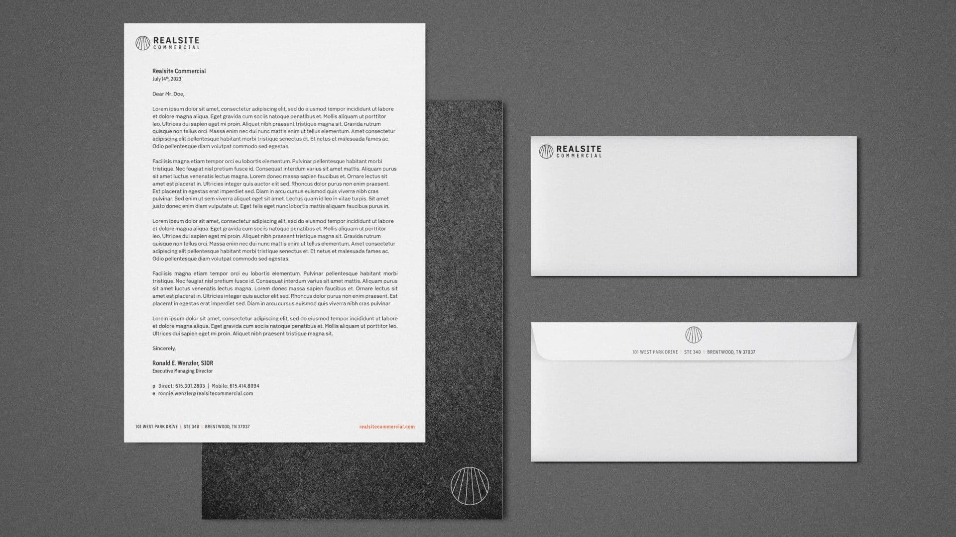
A signature worth signing for. A visual identity that commands attention and instills trust.
From pitch to property line. Brand presence that carries seamlessly across every touchpoint.
Designed to move deals forward. Collateral that connects with decision-makers and leaves a lasting impression.