Agricole Hospitality
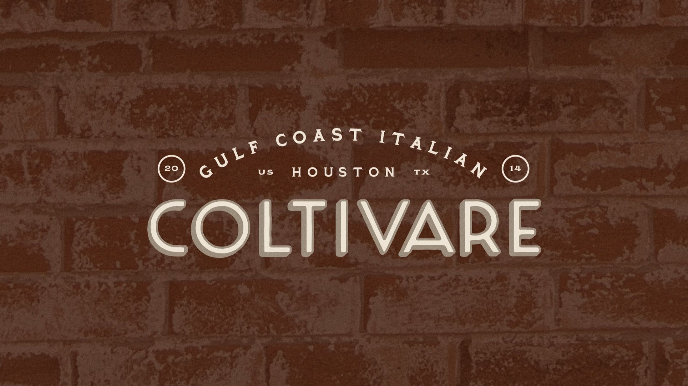
Coltivare is a Gulf Coast Italian concept from Agricole Hospitality, known for dishes that feel both rustic and refined—where local produce and regional technique come together in surprising, satisfying ways. The brand’s personality is raw, bold, and unpretentious—think Brad Pitt in Inglourious Basterds: a Texan speaking Italian, fully committed and completely unfiltered. With a growing lineup of house-made prepared meals, the team needed packaging that could match the character of the kitchen.
The Objective
Circa partnered with Agricole Hospitality to create a label system for Coltivare’s prepared meals—one that would stand out on shelves, support daily rotation, and reflect the brand’s premium quality and personality. From identifying a moisture-resistant, in-house printable solution to developing five unique designs that invited daily discovery, the system strikes the balance between grit and elegance. Bold typography, offbeat wit, and a nod to the required Texas meat stamp all come together in a visual expression that feels as local, intentional, and crave-worthy as the food itself.
The creative direction took shape from an animated GIF, an early visual cue that captured the raw-meets-refined Brand Roots of Coltivare, a Gulf Coast Italian concept from Agricole Hospitality. Its bold movement and unexpected tone became the foundation for the brand’s identity, guiding everything from label structure to the broader design system.
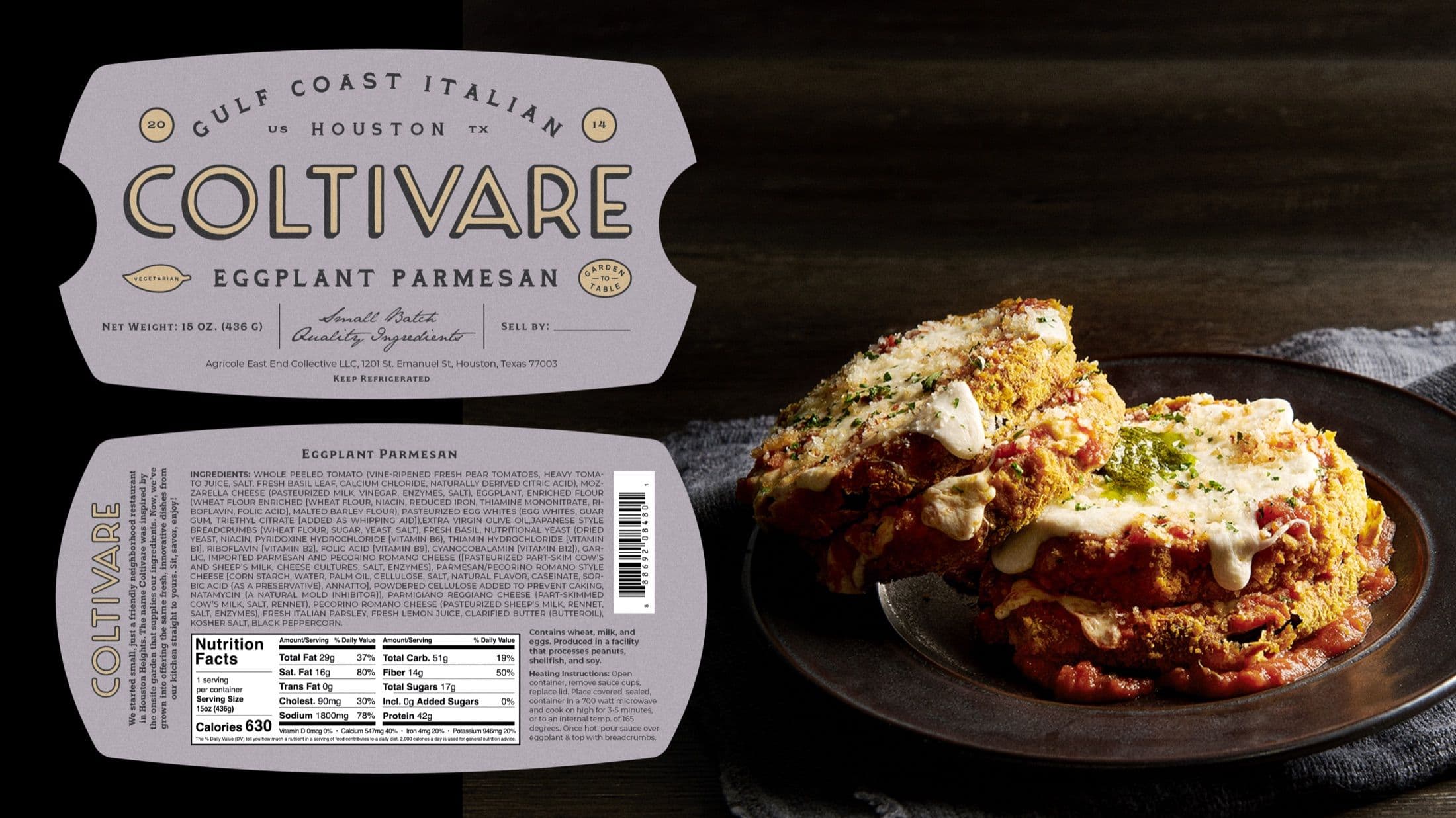
Each label captures Coltivare’s kitchen spirit with bold type, offbeat wit, and a nod to the Texas meat stamp. We created five distinct designs that can be printed in house, stand up to daily kitchen use, and rotate with the menu while still feeling unmistakably part of the same brand.
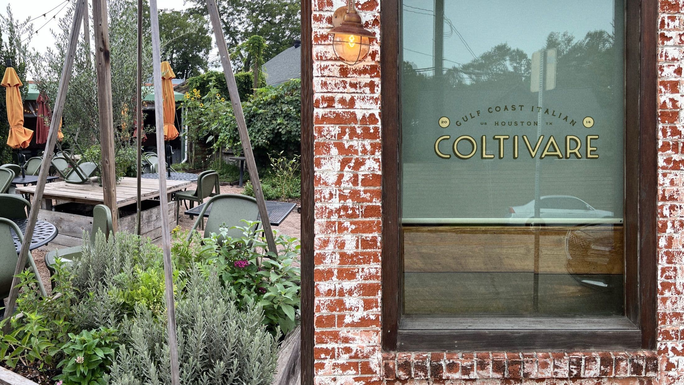
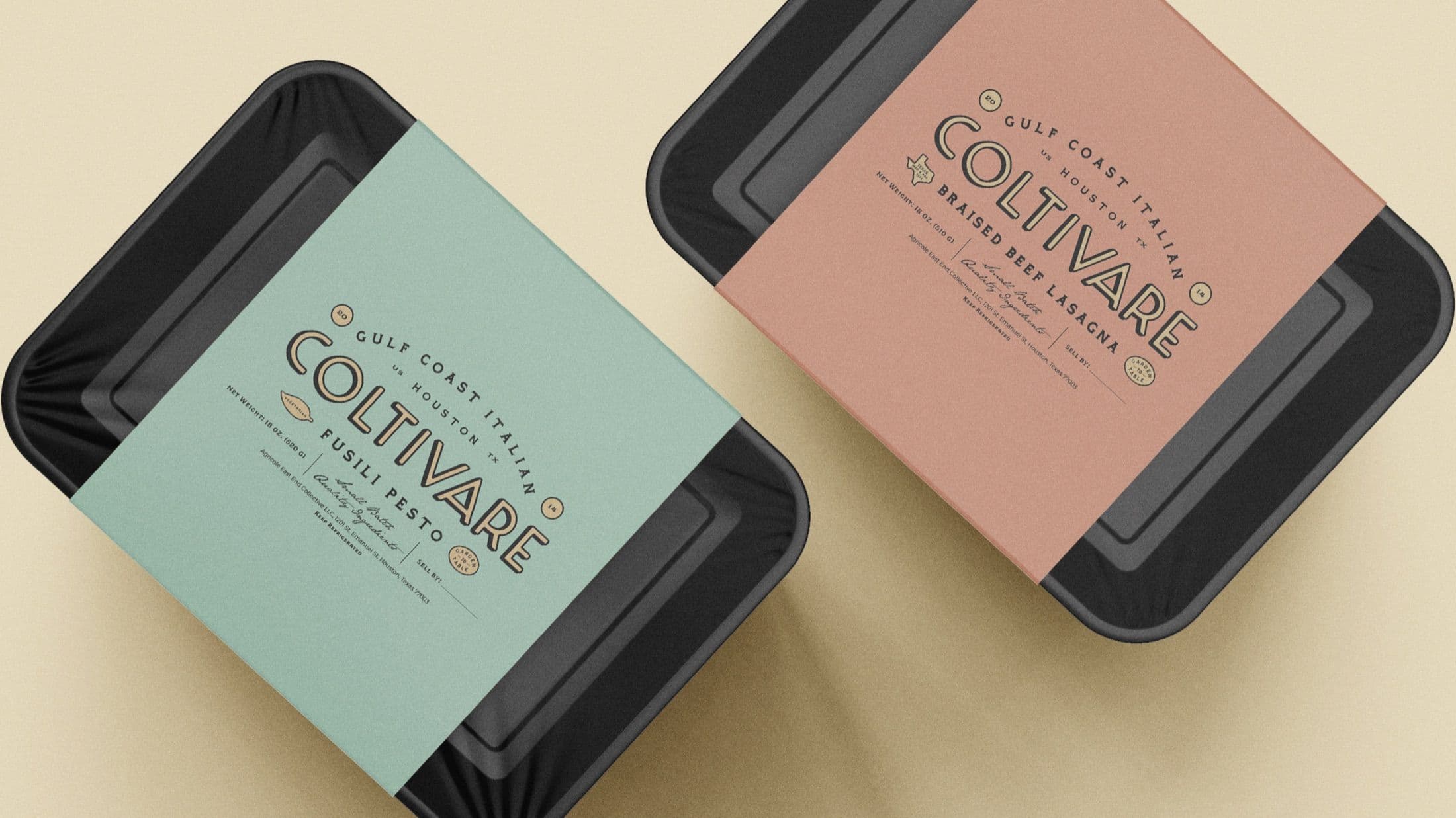
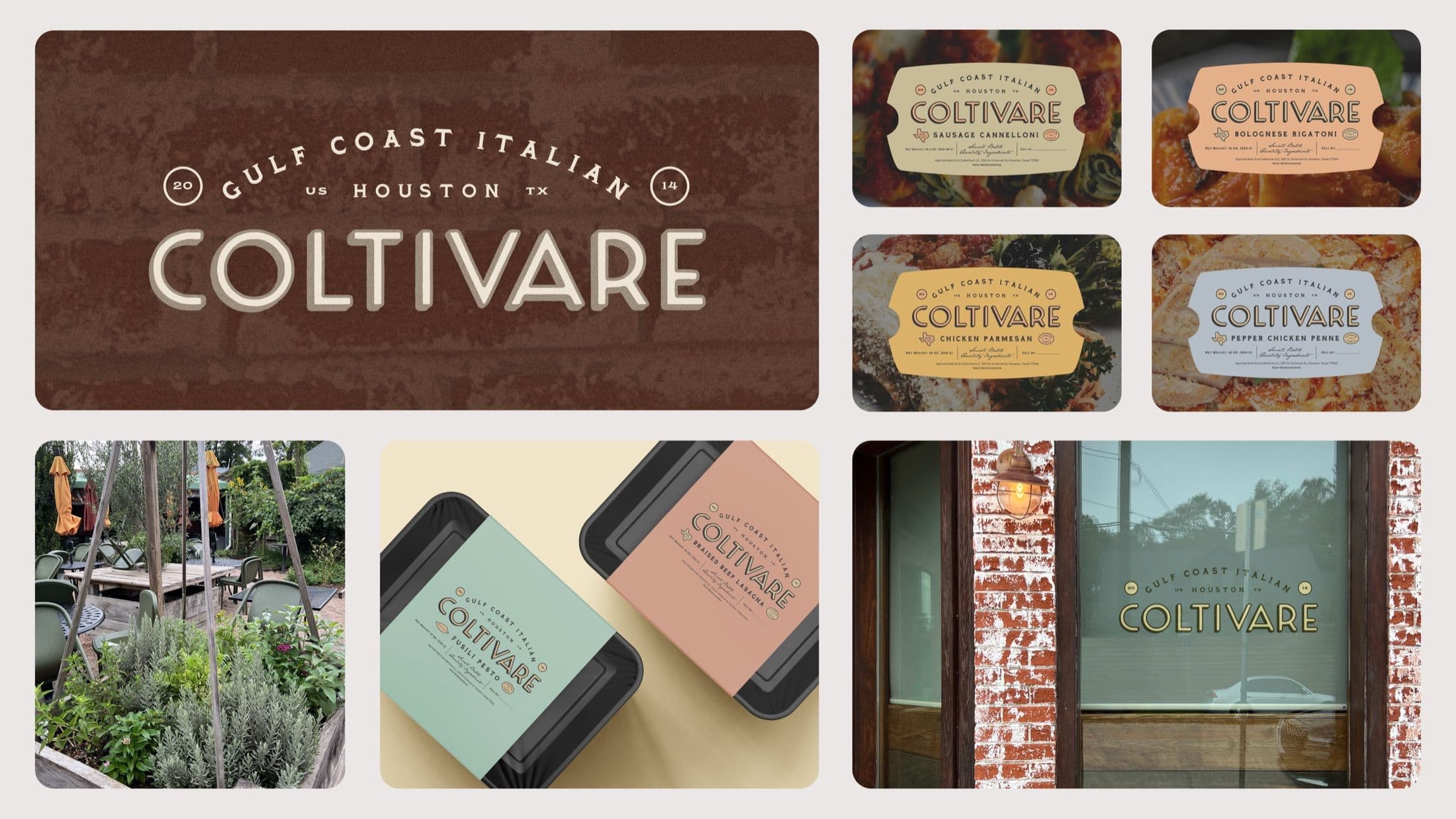
The final outcome is a cohesive brand refresh grounded in one of Coltivare’s core Brand Roots—a bold visual idea carried through the packaging, identity, and label design. Every element was shaped to reflect Coltivare’s bold personality and meets the needs of a fast-moving kitchen, resulting in a system that feels both expressive and built for real use.