Workerbee
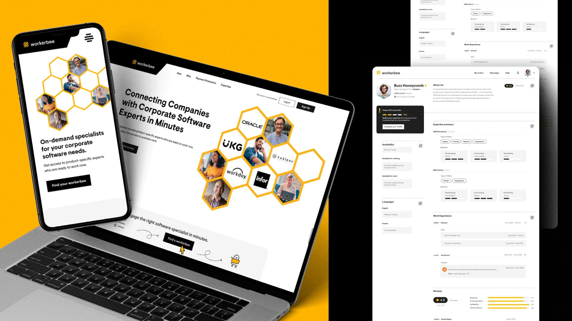
WorkerBee, the on-demand platform for corporate software needs, set out to establish itself as a trusted partner for corporate software solutions. They needed a brand identity that communicated professionalism, expertise, and digital adaptability. A strong visual identity was essential to differentiate them from traditional systems integrators and software vendors while reinforcing their credibility in the market.
The Objective
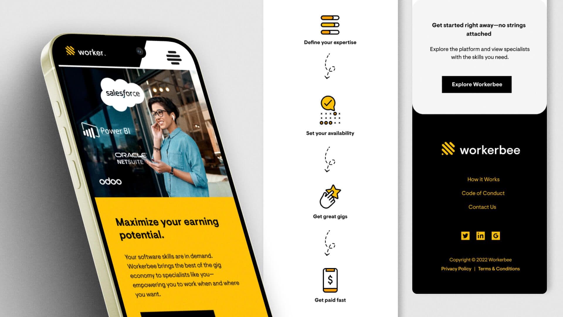
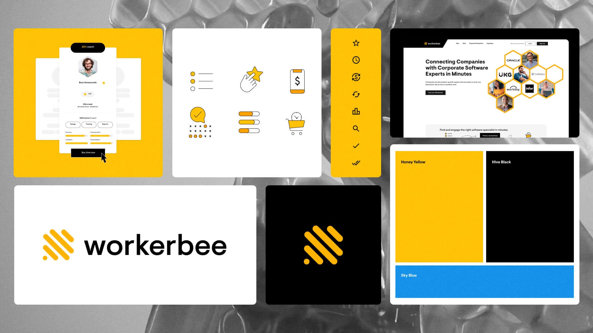
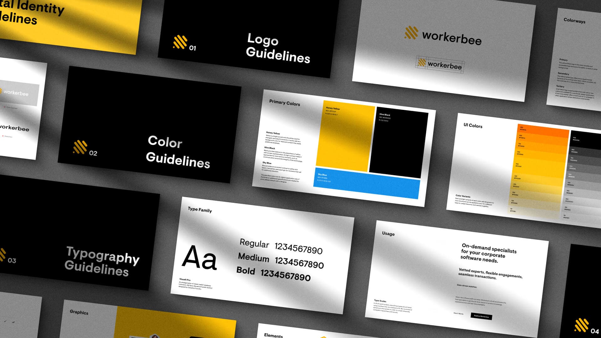
Circa developed a custom brand identity tailored for WorkerBee’s digital-first presence. The deliverables included: a custom logo that embodies professionalism and reliability; a digitally optimized color palette designed for consistency across web, mobile applications, and print materials; comprehensive digital brand standards to ensure a cohesive presence across all platforms. The result is a modern, polished identity that positions WorkerBee as a leader in the field of corporate software expertise.
A cross-platform brand guide built to enhance brand recognition and consistency for continued growth in the corporate SaaS market.
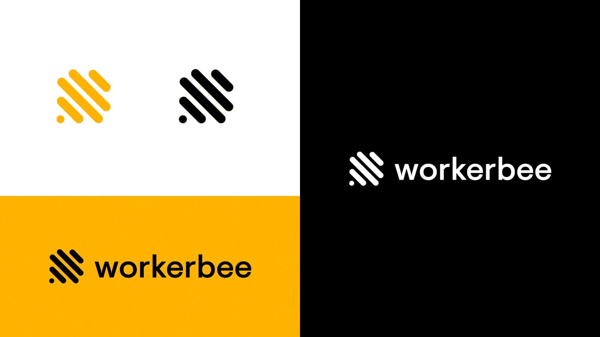


Key deliverables included logo design, brand guide, LinkedIn social marketing assets, email signatures, iconography, and website design.