Twinning Station

Equitable Property Company envisioned more than a development in La Vergne—they set out to create a landmark destination that could elevate the town’s identity and foster a true sense of community. The challenge was to capture La Vergne’s history and spirit while positioning the project to attract new residents, businesses, and investments.
Brand GuideBrand MessagingBrand PositioningContent StrategyDesignDesign ProductionGraphic DesignLogo DesignMarketing StrategySearch Engine OptimizationUI/UXUser FlowWeb DesignWebsite Development
Twinning Station 2026 logo: A circular, dark-green emblem featuring two interlocking 'S' shapes, stylized to resemble a möbius strip or infinity loop, surrounding the number '26'

The Objective

Circa partnered with Equitable to develop a brand identity that was both meaningful and market-ready. Drawing on La Vergne’s 1982 twinning ceremony with its French sister city, we crafted the name Twinning Station—a nod to heritage, connection, and progress. From there, we delivered a full identity system including logo design, color palette, typography, and a brand style guide. The result is a brand that balances charm and dynamism, honoring history while inviting growth.

A name inspired by heritage, connection, and progress.
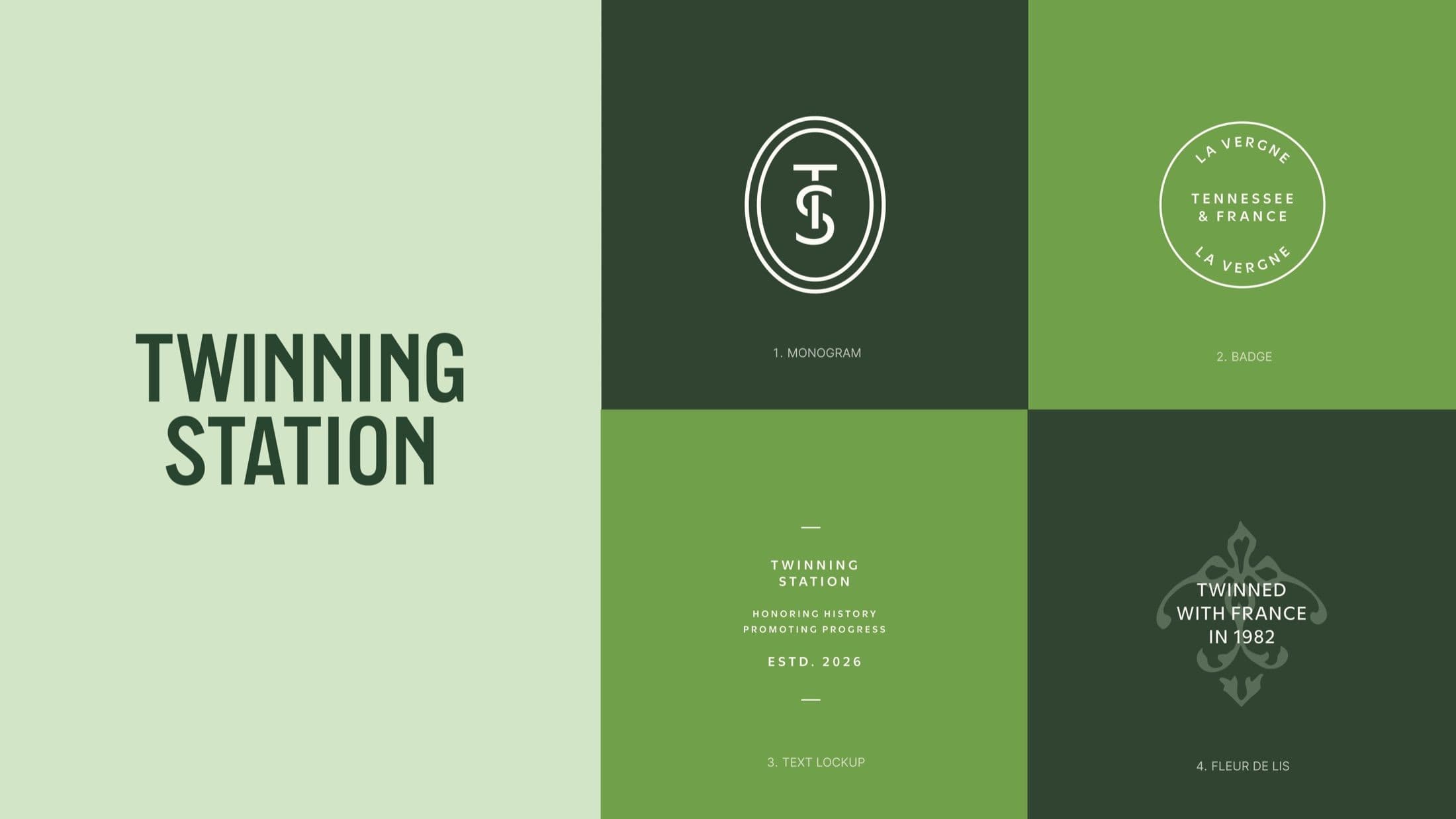
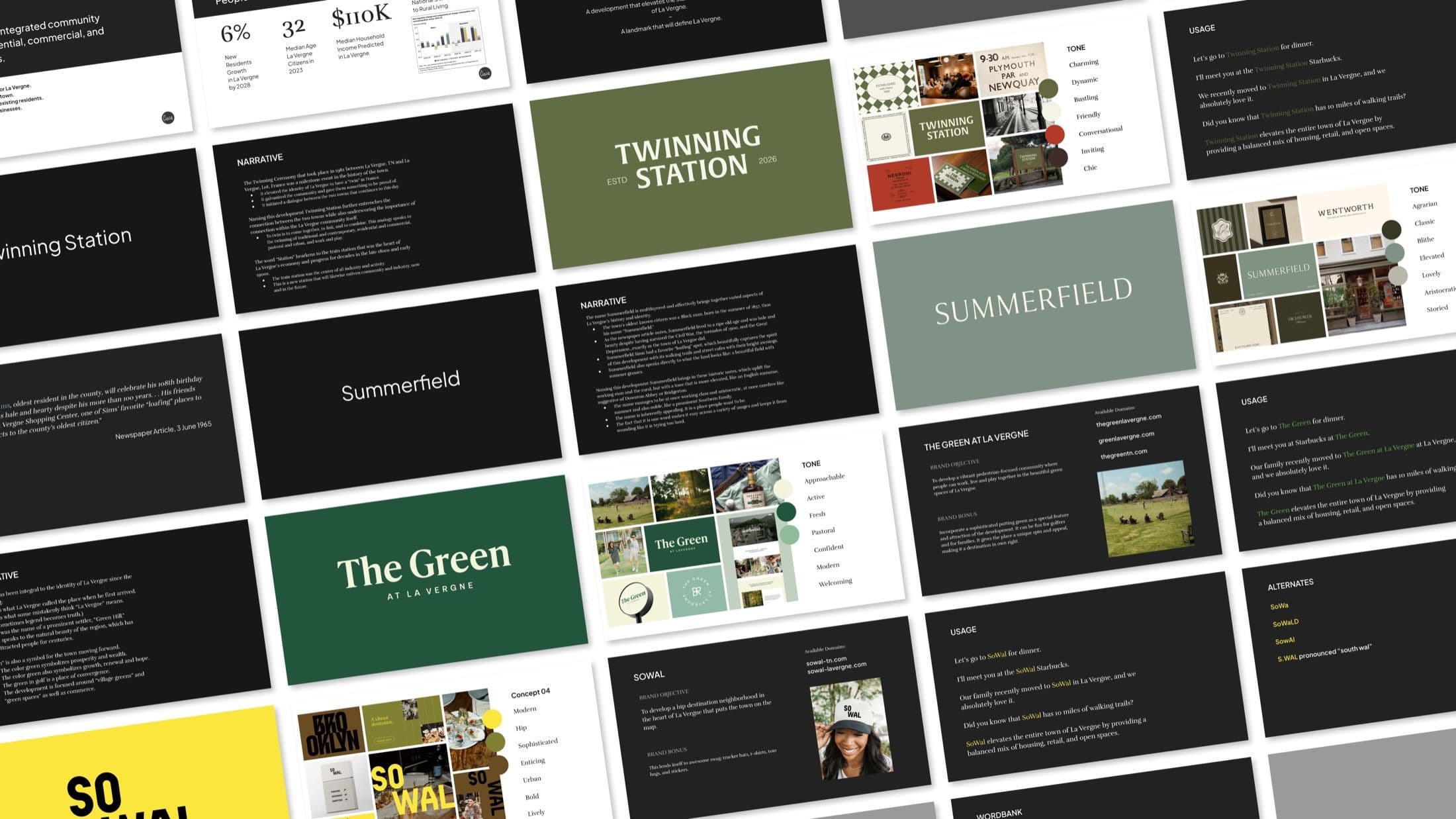
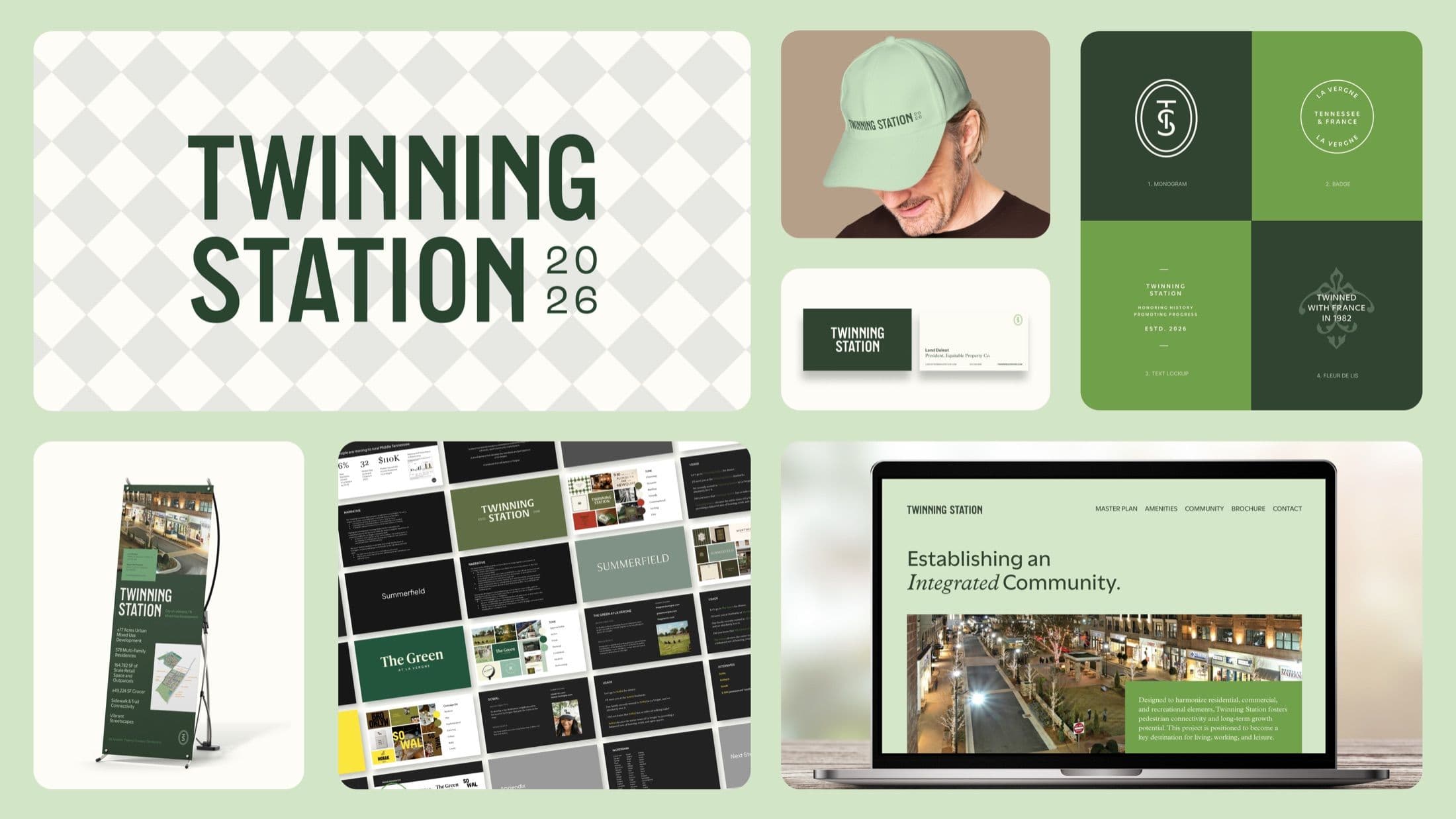
Visual identity sheet for Twinning Station featuring Monogram, Badge for La Vergne, Tennessee & France, Text Lockup, and a 'Twinned with France in 1982' Fleur de Lis design.Grid view of a branding presentation deck, showing slides for 'Twinning Station,' 'Summerfield,' and 'The Green at La Vergne' with text, imagery, and financial data.

Where La Vergne’s past meets its next chapter.
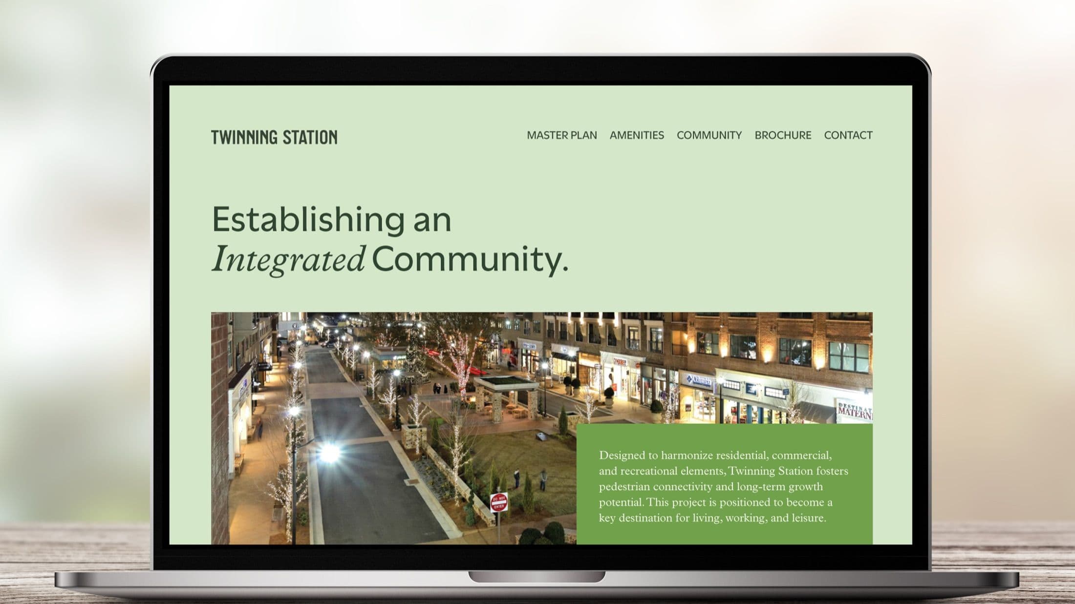
Twinning Station website mockup on a laptop showing the master plan navigation, a nighttime street view, and a paragraph describing the project as a key destination for living, working, and leisure.

A brand built to attract, connect, and endure.
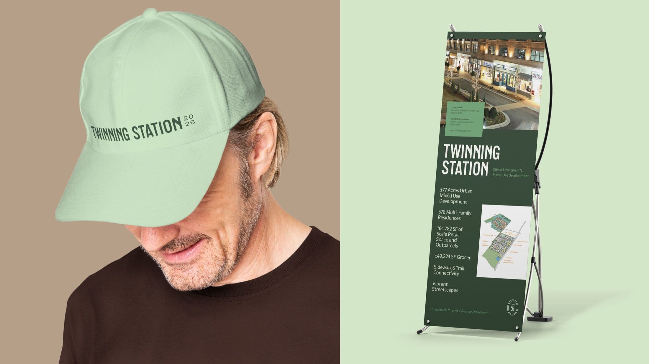
Mockup displaying Twinning Station branded materials, including a light green baseball cap and a dark green pull-up banner listing development statistics for the 77-Acre Mixed-Use project.A comprehensive collage of the Twinning Station brand identity, featuring the main logo, monogram, website mockup, presentation slides, branded baseball cap, business card, and pull-up banner.

Like what you see?

Start a Project