Armistead
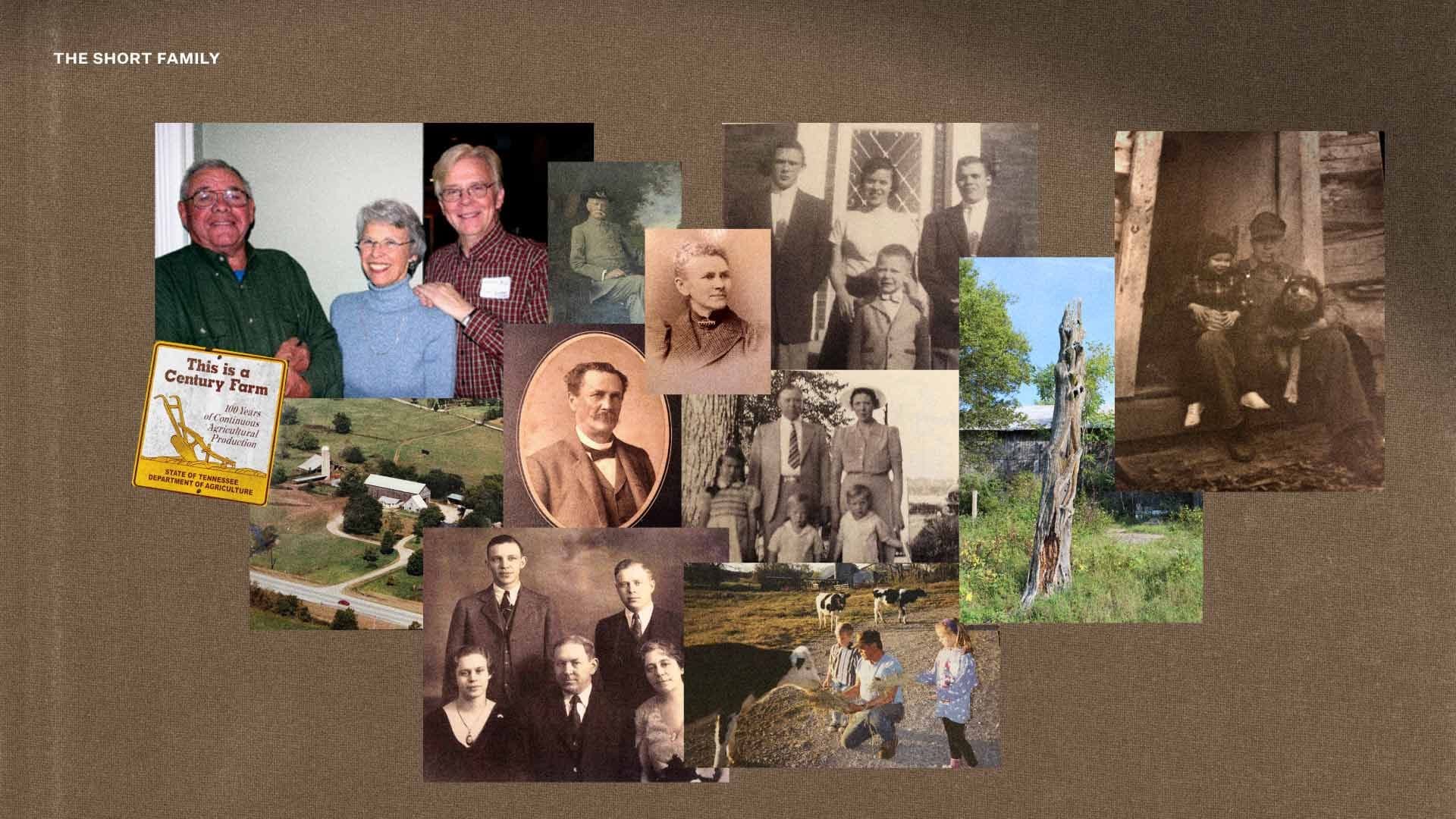
Established in 1887, the Short family’s 200-acre farm on the outskirts of Franklin has been a symbol of agricultural tradition for generations. In 2023, the family embarked on an ambitious transformation of this heritage site into a mixed-use rural village. Conceived as an “agrihood,” this innovative development harmonizes working farms with land conservation, fostering a community centered around agricultural traditions and experiences.

The Objective
Clarify the vision of the property for current and future stakeholders through a distinct brand, name, and identity.
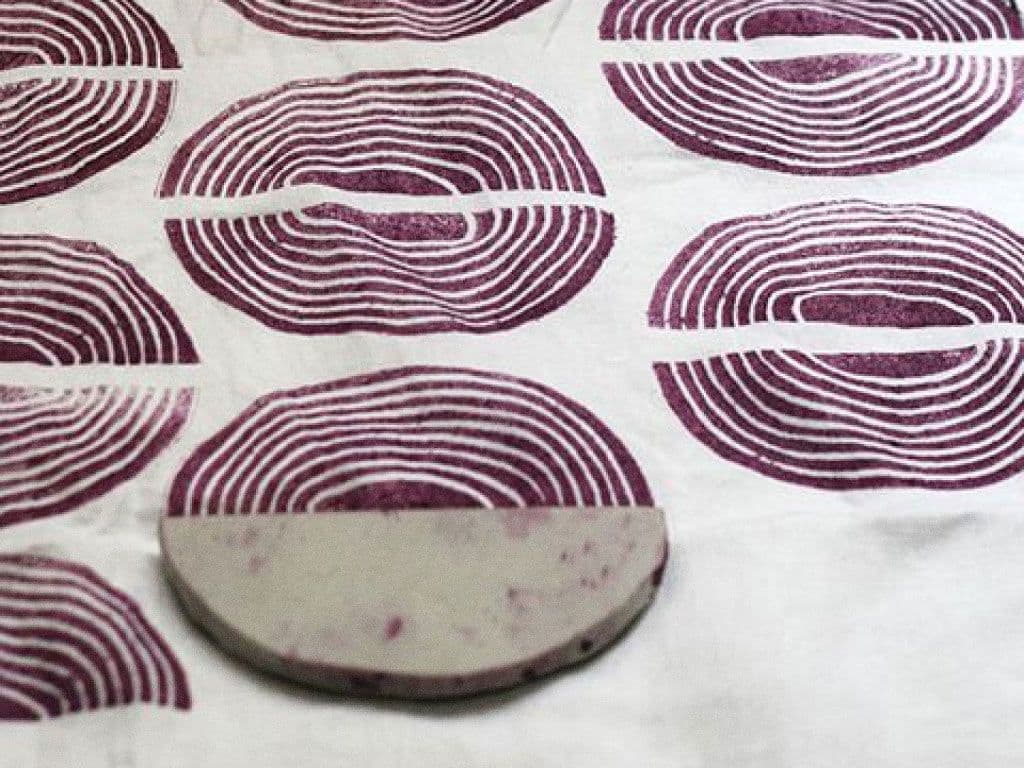
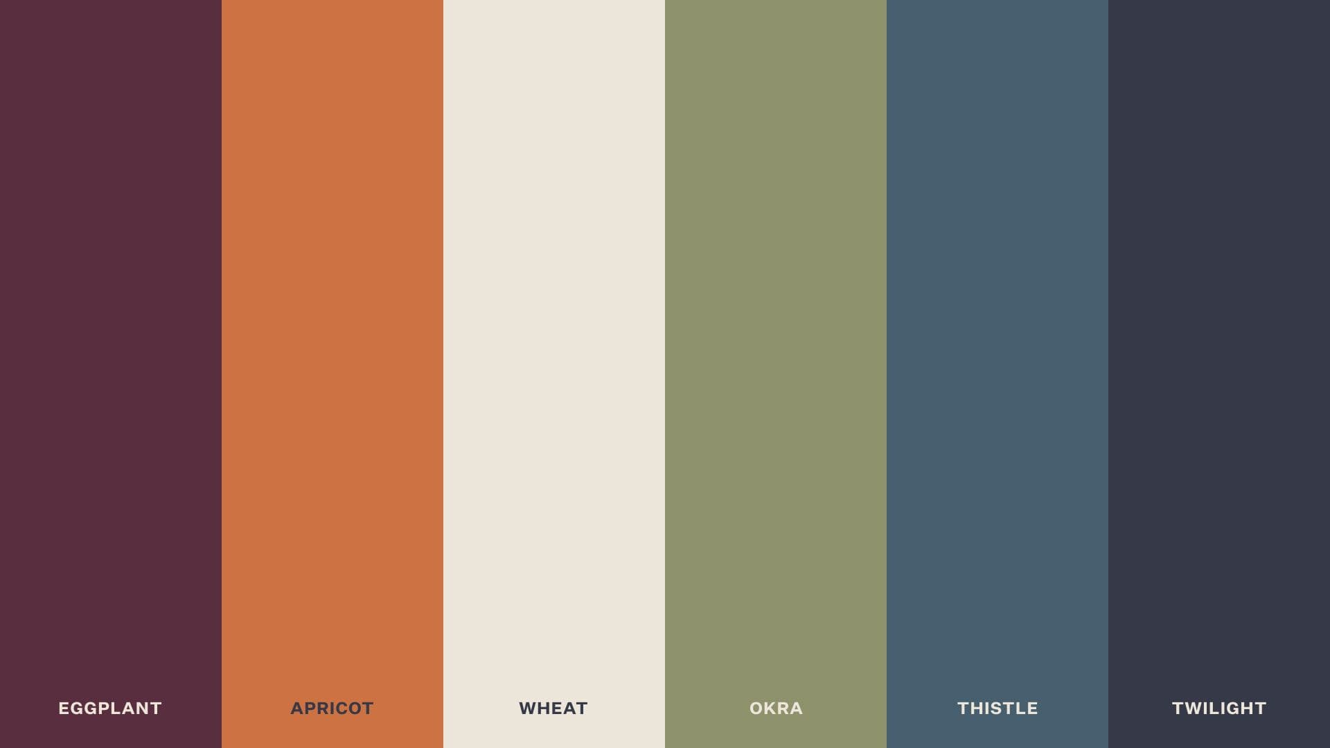
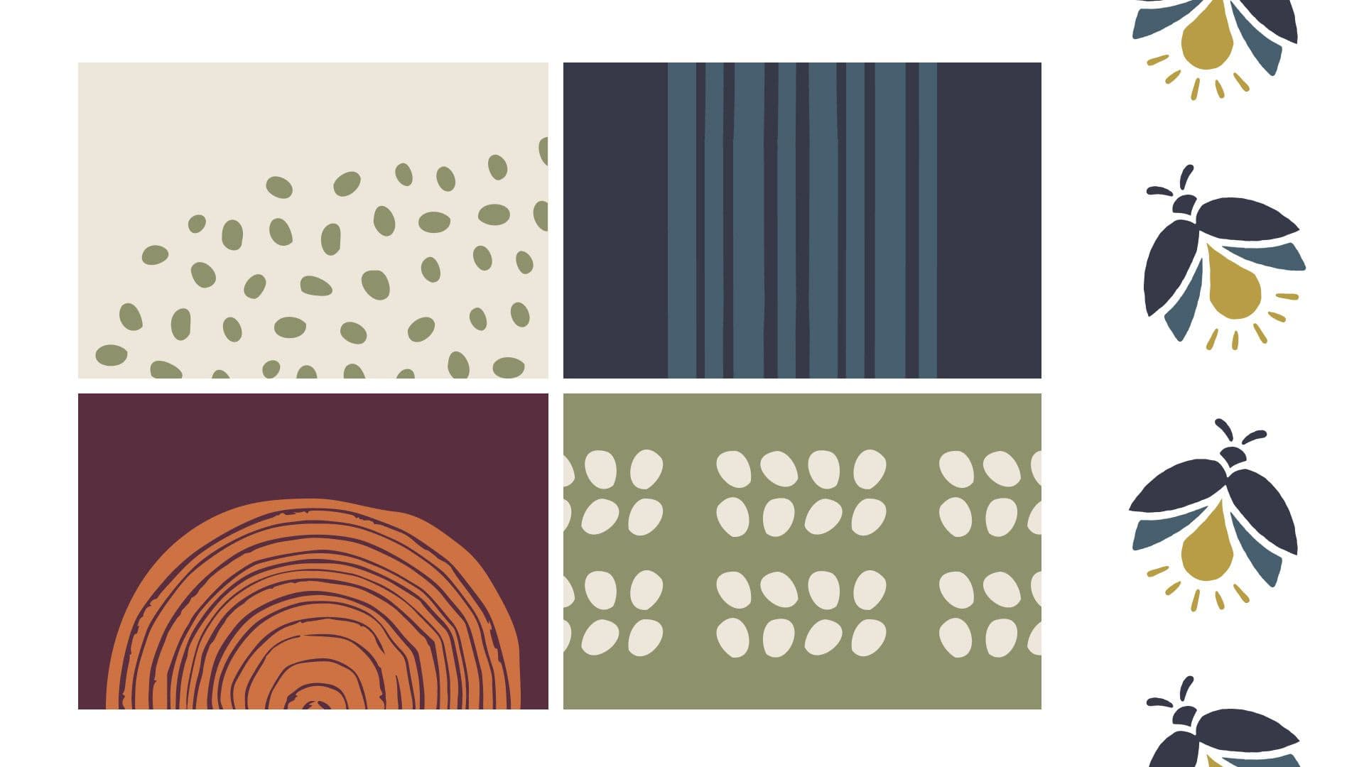
Organic, stamp-based art and earthy tones that evoke authenticity and a connection to simpler times.

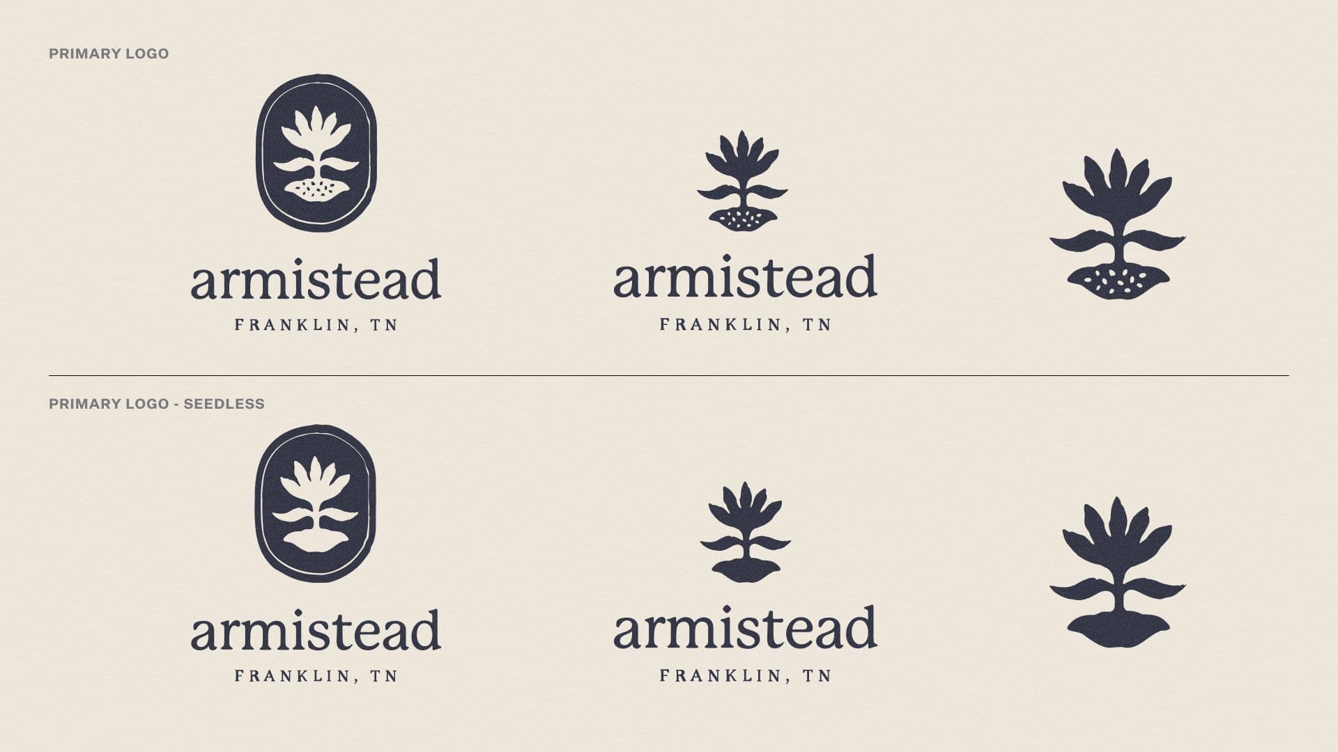
The name Armistead acknowledges a revered ancestor of the Short family while capturing the essence of a ‘town’ (‘stead’)—reflecting both the farm’s heritage and its community-driven spirit.